A collection of miscellaneous data visualizations I have made.
Published
July 1, 2025
A collection of small visualization projects from classwork and personal practice.
Code
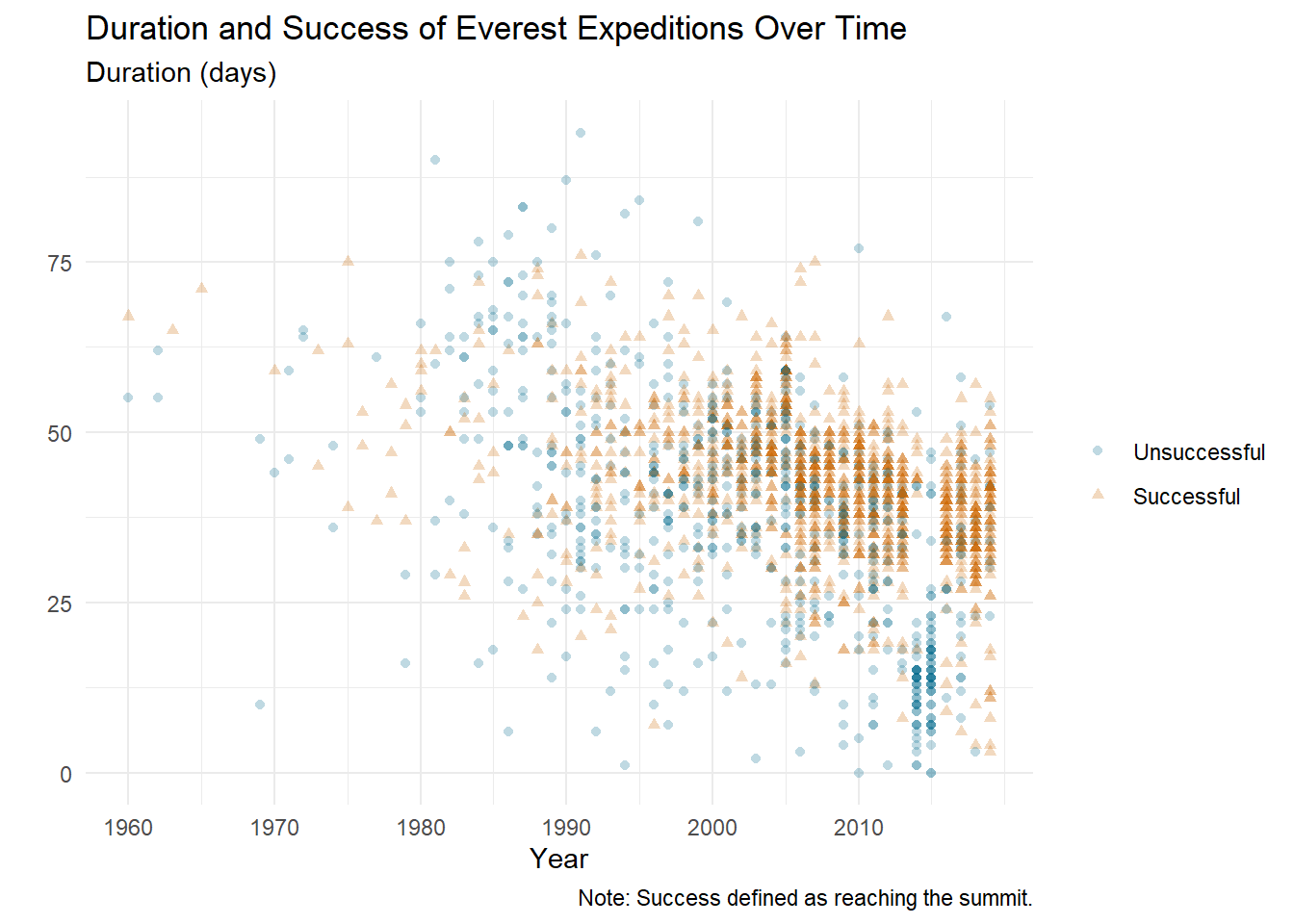
everest_plot |>ggplot(aes(x = year, y = duration,color =as.factor(success_indicator),shape =as.factor(success_indicator))) +geom_point(alpha=0.25) +scale_color_manual(values =c("0"="deepskyblue4", "1"="darkorange3"),labels =c("Unsuccessful", "Successful")) +scale_shape_manual(values =c(16, 17),labels =c("Unsuccessful", "Successful")) +labs(color ="", shape="",title ="Duration and Success of Everest Expeditions Over Time",subtitle ="Duration (days)",x ="Year",y ="",caption ="Note: Success defined as reaching the summit.") +scale_x_continuous(breaks =seq(min(everest$year)-1, max(everest$year), by =10))+theme_minimal()
everest-vis
Dot plot of Everest expedition duration by year, split by summit success. Durations become more consistent over time, with major drops during disaster years: the 2014 Khumbu Icefall avalanche and the 2015 Nepal earthquake/avalanche season.
Code
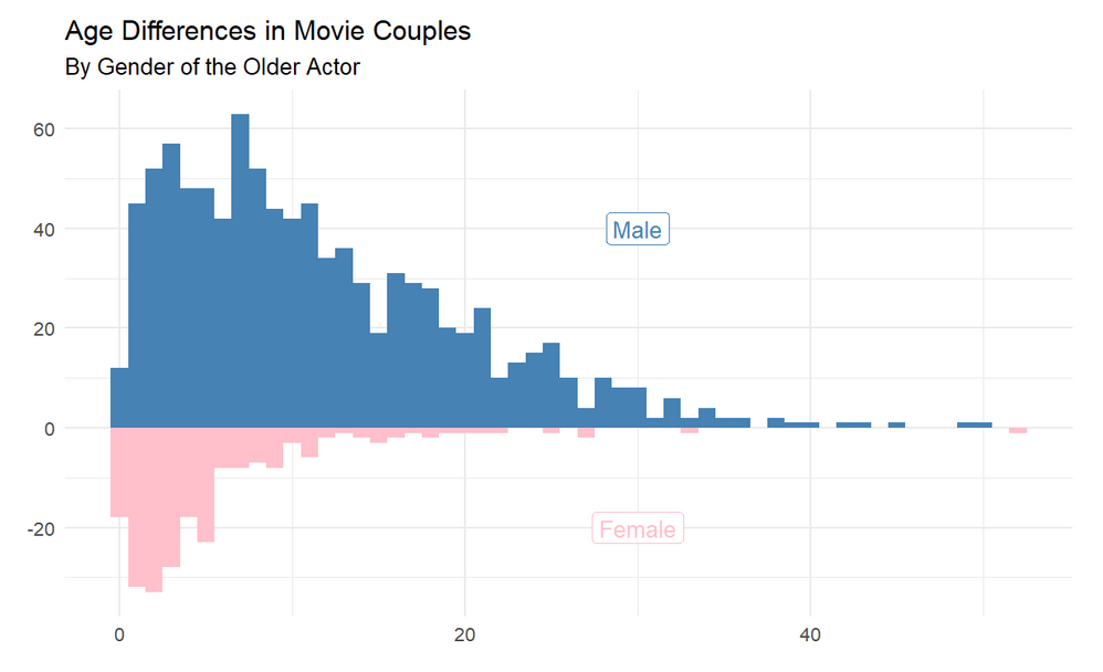
counts_male <- age_gaps |>filter(character_1_gender =="man") |>count(age_difference)counts_female <- age_gaps |>filter(character_1_gender =="woman") |>count(age_difference)ggplot() +geom_col(data = counts_male,aes(x = age_difference, y = n),fill ="steelblue" ) +geom_col(data = counts_female,aes(x = age_difference, y =-n),fill ="pink" ) +geom_label(aes(x =30, y =40, label ="Male") ) +geom_label(aes(x =30, y =-20, label ="Female") ) +labs(title ="Age Differences in Movie Couples",subtitle ="By Gender of the Older Actor",x ="Age Difference (years)",y ="Count" ) +theme_minimal()
age-gap-mirrored
Mirrored histogram of age gaps in movie couples by gender of the older actor. When the older actor is male, age gaps are generally larger and more variable; when the older actor is female, gaps are tighter and usually smaller.
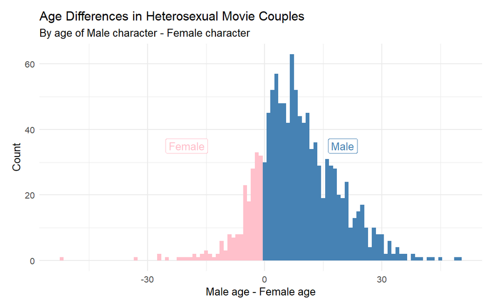
age-gap-hist
Histogram of age differences in heterosexual movie couples (male age minus female age). The distribution is mostly positive, which means men are more often older than their female co-stars, and often by larger margins.
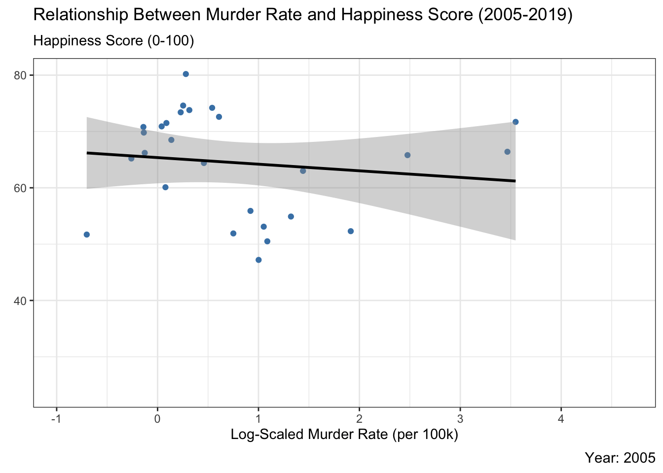
Country-level scatter plot of murder rate vs. happiness score with a fitted trend line over time. Higher murder rates are generally associated with lower happiness, though the strength of that relationship shifts year to year.
Code
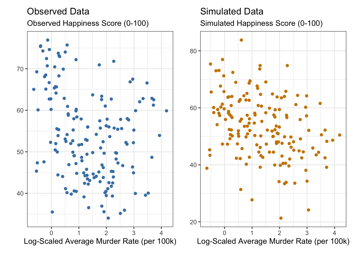
set.seed(42)predictions <-predict(linear_model, country_murder_happiness)residual_se <-sigma(linear_model)simulated_y <- predictions +rnorm(n =length(predictions), mean =0, sd =sigma(linear_model))observed <-ggplot(country_murder_happiness, aes(x =log(avg_murder_rate), y = avg_happiness_score) ) +geom_point(color ="steelblue") +labs(title ="Observed Data",subtitle ="Observed Happiness Score (0-100)",x ="Log-Scaled Average Murder Rate (per 100k)", y ="") +theme_bw()# Plot Simulated Datapredicted <-ggplot(country_murder_happiness, aes(x =log(avg_murder_rate), y = simulated_y) ) +geom_point(color ="orange3") +labs(title ="Simulated Data",subtitle ="Simulated Happiness Score (0-100)",x ="Log-Scaled Average Murder Rate (per 100k)", y ="") +theme_bw()observed + predicted
murder-happiness-2
Observed vs. simulated scatter plots from a linear model. The simulation captures the overall trend but is more tightly clustered than the real data, suggesting the model underestimates variability.
Code
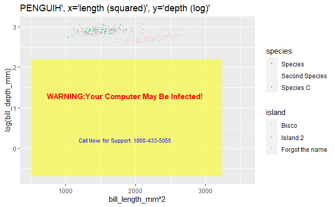
ggplot(data = penguins,aes(x = bill_length_mm**2, y =log(bill_depth_mm),shape = species, color = island)) +geom_point(size =0.1, alpha =0.5) +labs(title ="PENGUIN",x ="length (squared)",y ="depth (log)") +annotate("rect",xmin =500, xmax =3240,ymin =-0.7, ymax =2.2,fill ="yellow", alpha =0.5) +annotate("text",x =1850, y =1.3,label ="WARNING: Your Computer May Be Infected!",color ="red", size =4, fontface ="bold",hjust =0.5) +annotate("text",x =1850, y =0.2,label ="Call Now for Support:\n1800-433-5055",color ="blue", size =3,hjust =0.5) +scale_shape_discrete(labels =c("Species","Second Species","Species C")) +scale_color_discrete(labels =c("Bisco","Island 2","Forgot the name"))
ugly-vis
An intentionally bad chart: unclear labels, noisy styling, unnecessary transforms, and distracting annotations. The point is to show how design choices can hide signal and mislead interpretation.